Responsive Email Design - Waste Management, Inc.
Developing a Responsive Email: Media Queries
Similar to responsive website design, the main element for responsive email design is CSS media queries. A media query can detect the pixel size of the screen on which that email is opened and based on the size detected, it can trigger styles to target only that particular size in order to alter the layout best suited for that display.
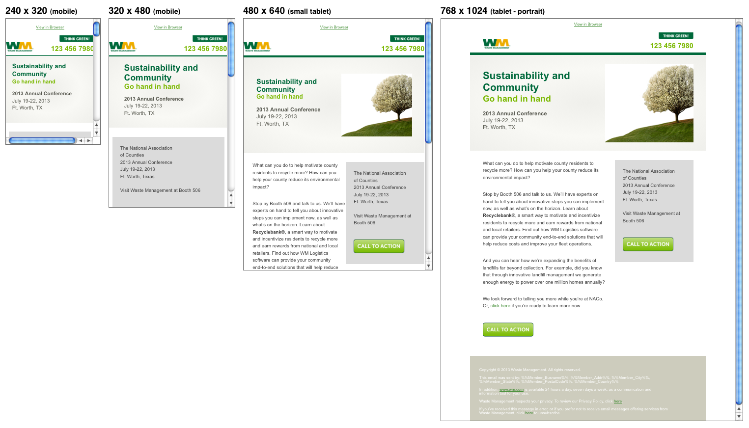
Below is a screenshot of a responsive Waste Management, Inc. email template that we developed rendering in two different mobile and tablet screen sizes.

The media queries used for this responsive email design are:
@media all and (max-width: 260px){
	/*240px wide mobile styles here*/
}
@media all and (max-width: 400px){
	/*320px wide mobile styles here*/
}
@media all and (max-width: 550px) {
	/*Small tablet styles here*/
}
@media all and (min-width: 401px){
	/*mobile only styles here*/
}
@media all and (max-width: 260px){
	/*240px wide mobile styles here*/
}
@media all and (max-width: 400px){
	/*320px wide mobile styles here*/
}
@media all and (max-width: 550px) {
	/*Small tablet styles here*/
}
@media all and (min-width: 401px){
	/*mobile only styles here*/
}
Since the desktop version is only 600px wide, a media query was not needed for the regular tablet version, which is 768px wide in portrait mode.
Developing a Responsive Email: Hiding Content
While developing this Waste Management, Inc. responsive e-mail, we ran into some major issues that were eventually solved. The roadblocks included hiding mobile content in the desktop version of Gmail, hiding mobile content in Microsoft Outlook 2007 and Outlook 2013, and banning blue links on iOS devices.
Issue #1: Hiding mobile content in desktop version of Gmail.
Solution: Since Gmail doesn’t like display: none here are the styles we used in order to hide the mobile content with the key element being max-height: 0.
		@media all and (min-width: 401px) {
		div[class="mobile-only"] {
			max-height: 0 !important;
			display: none;
			font-size: 0;
			line-height: 0;
			padding: 0;
			mso-hide: all;
			}
	}
Issue #2: Hiding mobile content in Microsoft Outlook 2007 and Outlook 2013
Solution Our mobile content wasn’t hiding in Outlook 2007 and 2013 even with mso-hide: all above in Issue #1 so we had to wrap the mobile content around the following Microsoft conditional comment.
	<!--[if !gte mso 9]><!---->
		<!--Mobile Content Goes Here-->
	<!--<![endif]-->
The gte stands for greater than or equal to and mso stands for Microsoft Office.
Issue #3: Banning Blue Links on iOS Devices
Solution: This issue isn’t specific to only responsive e-mails but all HTML e-mails in iOS. Things such as phone numbers, addresses, dates, and sometimes even random words like “tonight” automatically turn blue and underlined in emails viewed on any iOS device. These bits of information trigger app-driven events such as making a call, launching a map, or creating a calendar event. While this feature may benefit plain-text emails, it’s a nuisance in HTML emails. In order to solve this, we wrapped span tags surrounding the target text and added our own desired link styles in classes in the <head> since the native mail client in iOS supports embedded style sheets.
    .appleLinksWhite a {
        color: #fff;
        text-decoration: none;
    }

    <span class="appleLinksWhite">%%Member_Addr%%</span>
Conclusion
A new era of email design is just upon us: Responsive Email Design. Developers and designers have already started forging the pathway towards better user experiences for individuals that view emails on mobile devices through responsive emails. With more mobile subscribers switching to smartphones the question marketers should ask is not why responsive email design should be implemented but how they can implement responsive email design into their brand as soon as possible. The future of email is responsive and this can no longer be just an option but a necessity in order for brands to stay relevant.
 RETURN